Content

The PITSTOP Lekki

Tuesday, October 20, 2015 0 comments
I Love Food.

Didn't need much motivation coming up with these, but the clients design requirements were specific. I was impressed that they came up with a sketch/design/mockup/art direction.
Play around with the checkered flags, secondary colour is yellow and I see they'd like to have a page curl/pagination effect some where in the mix. As per colour scheme it's an obvious Black/White, Yellow and Red.

I'm watching Arsenal hold Bayern to a 0-0 win, yes Win :| as I line up the elements of the Identity design... Up first, the Name Brand Element.
The target Secondary Colour borders "Medium Yellow C" and "Orange". However, for accurate matching across several media, I was able to convince the client to settle on PANTONE 803 C.

Arsenal have just gone up 1-0, and as I upload the primary applications of the PitStop identity design,  I smirk at the #BetterThanArsenal crooners on twitter only yesterday...oh the bants in a bit.
Primary Identity Elements not requiring heavy reading spot the All Yellow BackPage and Checkered + Yellow FrontPage. 

For Secondary Identity Elements like Menu's, LetterHeads, requiring readable text I have used a pagination design element. The client was exceptionally pleased about it.


Arsenal have won by 2 goals, Bellerin is lightning quick, DSTV went off due to bad weather... but now I'm watching a Mourinho interview lol. 

Art and Functional Discombobulation
I only used that word to classify Mourinho's interview strategy, but the meaning fits the purpose: I've mashed up a Functional Text display system, with an art exhibitory to carry forth the PitStop fine dinning philosophy. I remembered the passion of the owner and the care and detail the chef and managers put into presentation and service. I figured we had to depict that ideology in the identity. 

See a few PitStop Yum's as I call them.


no wait, the second plate is mine... I love food.
Back to our design elements as seen below:

Fine Dining Art Incorporations


Marks of Authenticity


1. 5 point diamond checkered star on each corner of the PitStop Name brand.
2. 20% white layer inside the "O" in the PitStop name brand.
3. The Checkered flag starting on the right blends into yellow from the point the flags turns and overlaps into itself.

Arsenal 2 - 0 Bayern (In your faces ManU haters)


Read more »

Everything Medical Nigeria

Wednesday, April 10, 2013 0 comments

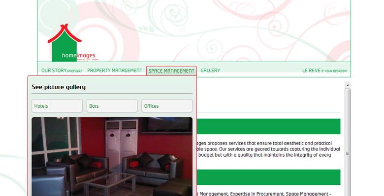
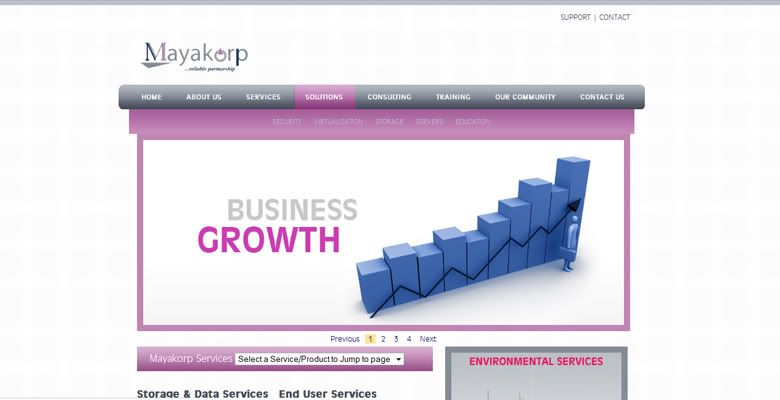
The Request was pretty straight forward. The Medical Professionals at Everything Medical Nigeria required a website to portray their expertise and offerings. We ended up having to re-illustrate their logo, but it was a fun project. Doctors are pleasant :)

Check out http://www.everythingmedicalnigeria.com/
Read more »

The Office Everything Easter Goody-Bag

0 comments

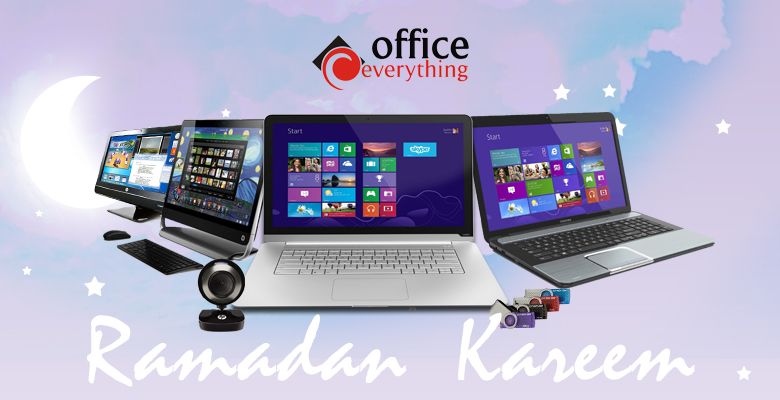
Office Everything, with stores located at the Ikeja City Mall and Leisure Mall in Surulere and their Showroom located at Jimoh Odutola street wanted a campaign for the Easter celebrations.

With specific Ad Campaign parameters, We came up with the "Easter Goody-bag Hamper" campaign. Very funny story how this came about, but it started with a prayer for wisdom from God.

The Visual Ad campaign included Press, In-store branding and Social Media implementations to the duo-style visuals used.

See Implementations below:

Press Strip Format

In Store Banner Format
The entire campaign was fun from conceptualization to reviewing the simple pleasant reactions of clients as they walked into the stores. Everyone can relate to Easter, if for nothing, it brings a public holiday :)
Read more »

Eva Says -- Eva Alordiah's Mini Series

Tuesday, May 1, 2012 0 comments
Eva Alordiah has constantly looked for new ways to connect, and stay connected to her fans. It all started as a series of "voice recordings" and has evolved into a full-on Reality Mini series centered on the ELOY Best Rap Act 2011 winner.

Eva fans are in for a thrilling time with the "Eva Says" series as she takes them on a whirlwind journey into life through her eyes. The series will show everything from studio sessions, to live performances and road tours, whilst exposing her fashion addiction. You'll never miss Eva ever again.

The year 2012 for this NEA 2011 nominee will be very exciting, you're advised not to blink, or you might miss it.

Watch Eva says Episode 1 & 2 below:


Eva Says Episode 1


Eva Says Episode 2

Eva Says is a 3UD Brand Management production. All rights reserved.
Read more »

Web Design 101

Thursday, April 19, 2012 0 comments
The Full Guide, Coming Soon!

Read more »

The GIGO E.P

Monday, February 20, 2012 0 comments
Coming Soon!
The entire GIGO E.P release campaign in review, from teasers to final release.
Read more »

The BlueBunny Soccer Experience '2010

Monday, February 6, 2012 0 comments

The Final Product

The Brief:  

The client wanted marketing communications in form of an artwork to drive sales of their products. The enticing range of BlueBunny Ice Cream scoops where to be the subject of the Ad, and being World Cup season at the time, the entire drive was to leverage on the love of the game in attracting customers to buy the product.

The Inspiration:  

The FIFA world cup fever had well and truly hit Nigeria. Everyone was buzzing about Nigeria's chances, our clients where planning to go all out with new flat screen tv's for viewers of the great game to watch while they enjoy their ice cream.

The Tools:  

Imagery
The final design had to primarily show "the product", as impulse buy products ultimately sell themselves. But this had to have a secondary focus, one that appealed to passionate fans of the world's most popular sport in the season of the world's most popular competition, it had to be a football themed Ad.


Photography inspiration: Don Toallin Absorbent Paper ad print campaign. Agency: Leo Burnett Venezuela
Photographer: Rodolfo Benitez

Copyright


Software
Adobe Photoshop CS4. User must have mastery in basic image editing and manipulation to complete.

Implementation Progression:

First layer shows the arrangement
of BlueBunny scoops.


Second layer shows the inclusion
of a hand. Not just any hand, a grip
ready hand.
                             
Third Layer shows the inclusion of the world cup into the grip ready hand
Final Layer shows the final touch. The creamy top.
Conclusion:
A mixture of filters and patience in Image manipulation makes the entire Ad. Please note: This whole process can be done with a lot less effort with the right kind of photography.
Read more »

More 3UD

3UD pronounced THUD is a brands design and brands management company, specialized in start-ups.

With expertise in design for advertising and a background in Information Technology, 3UD is well equipped with the knowledge of modern and traditional marketing communication tools and has the capability of taking your brand from conceptualization to achieving market leadership.

Contact a Thud rep to find out what we think of your brand, and how we can transform it to surpass your expectations.


Ugo Date'
3UD